This is a project from year 3 of my BA at the University for the Creative Arts (UCA). I had (still have) an interest in typography and type design. The goal of this project was to explore the process involved in creating a typeface from scratch as well as gain an understanding of how individual letters work together towards a larger whole.
The process was based on research, sketching with pencil and paper, scanning, tracing in Adobe Illustrator and finished in Font Lab. I chose to make a geometric inspired grotesque typeface, partially because I really liked typefaces such as Futura and similar very much, and partially because I thought it would be a good place to start as a beginner due to strict lines and rules for the design. Throughout the process it turned out to not be the case, but I liked the direction of the work and chose to stick with it rather than start over. At the end of the project I started looking into a variant with serifs to look into the possibilities of creating a family, but this never progressed further than an experiment.
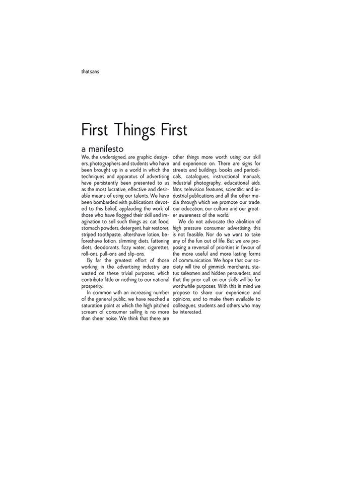
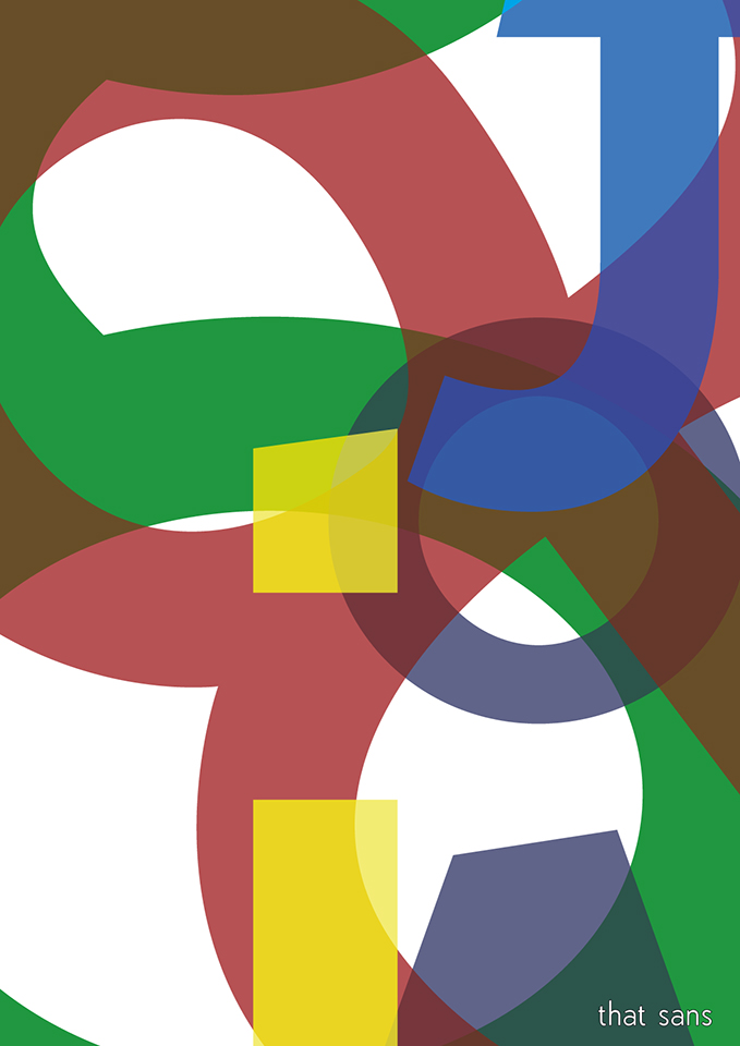
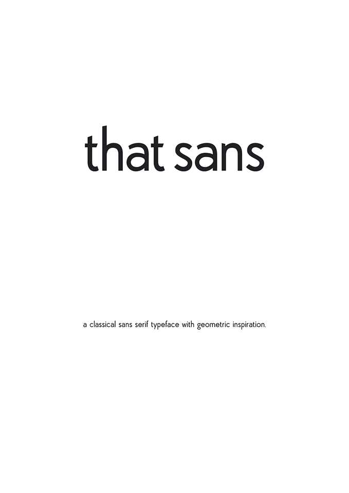
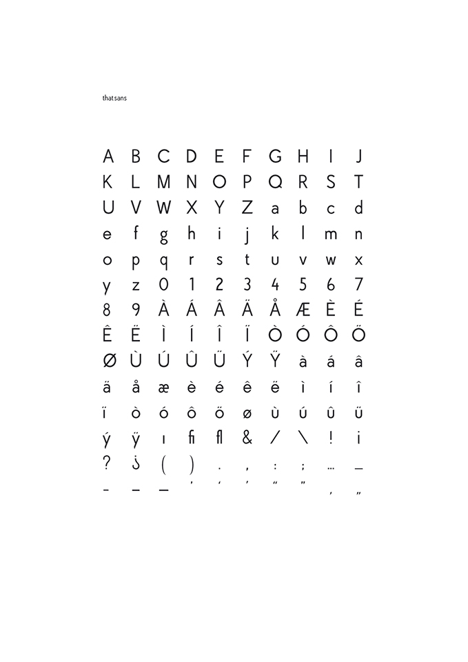
The typeface, called “that sans”, is meant to be used to set general text. I focused on high readability at small sizes. There are 140 glyphs in one weight, including a-z, A-Z, 0-9, various accented variations, common western punctuation and some ligatures. I have made a functioning font file, but never published it.
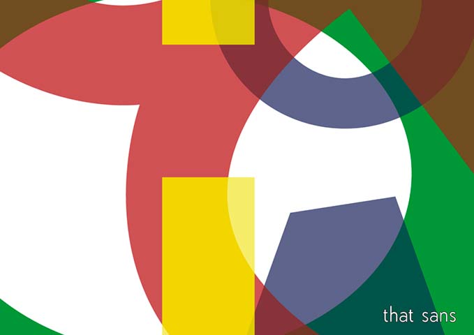
Shown here are the posters made to present the typeface.
Du må være logget inn for å legge inn en kommentar.